
Hellenic Wellbeing
A warmer identity and an online shop for a Greek skincare brand.
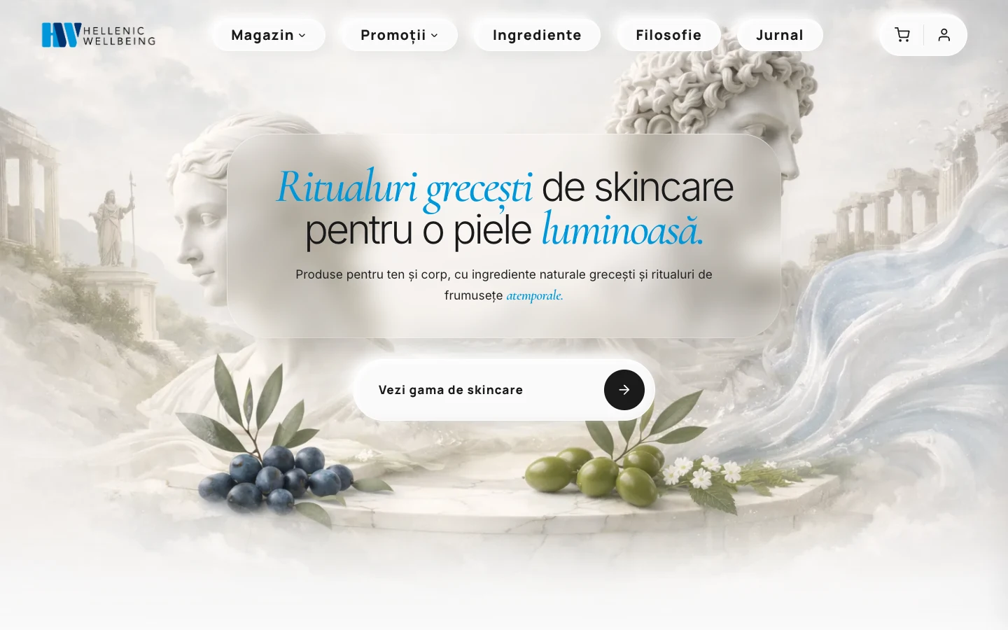
The products had a story. The old branding wasn’t doing it justice.
Hellenic needed a stronger visual presence without becoming a different brand. I refined the existing logo and carried that softer direction through the entire shop: creamy colours, space around the products and photography connected to their Greek origins.
A small change to the logo. A different feel.
I rounded the corners of the existing lettering instead of replacing the logo. That made it feel softer while keeping it recognisable. The website follows the same direction, from the warm palette to the shapes and spacing.
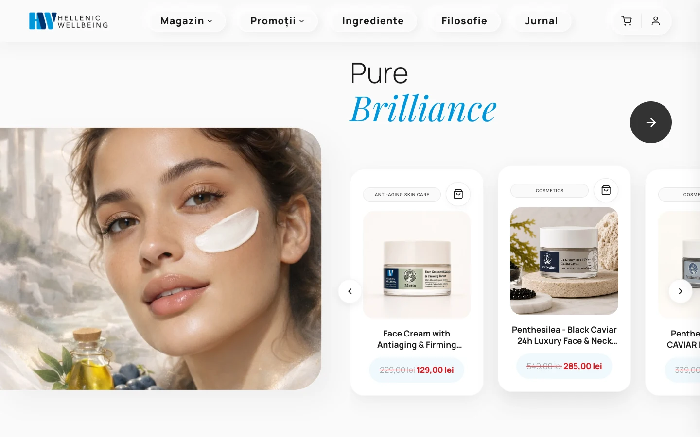
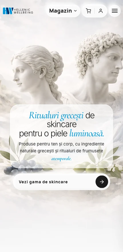
The same journey on desktop and mobile
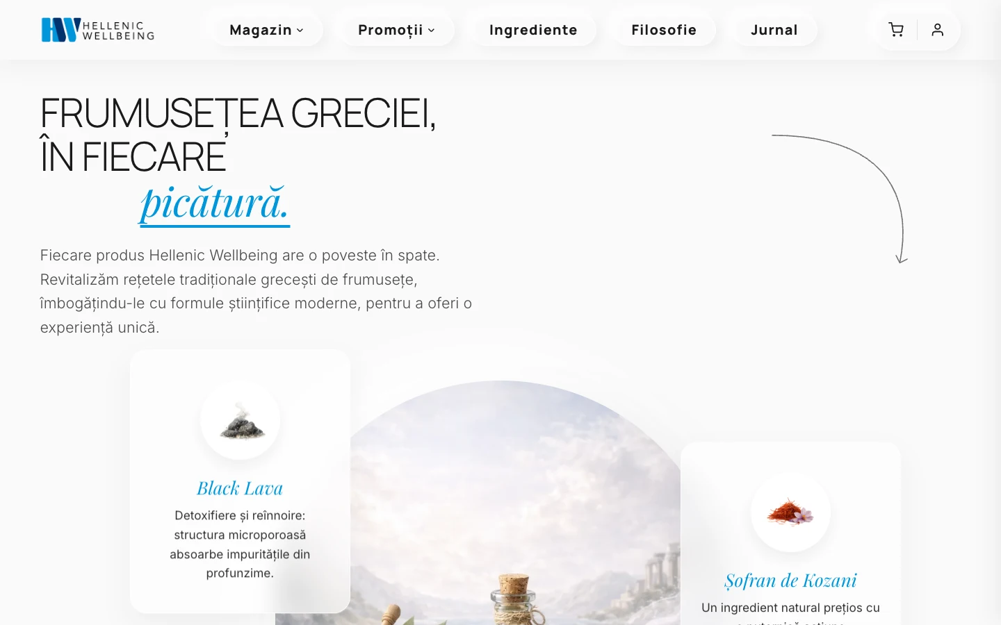
Let people see what’s in the products.
The ingredient sections pair product information with Greek landscapes and photography. Customers can explore what the range is made from, alongside the products themselves.
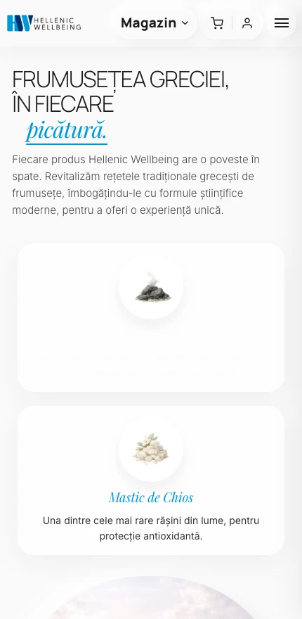
The same journey on desktop and mobile
Give the brand a working shop.
I connected that visual direction to collections, product cards and product pages. On a phone, those same elements are rearranged so people can browse the range without working around a desktop layout.
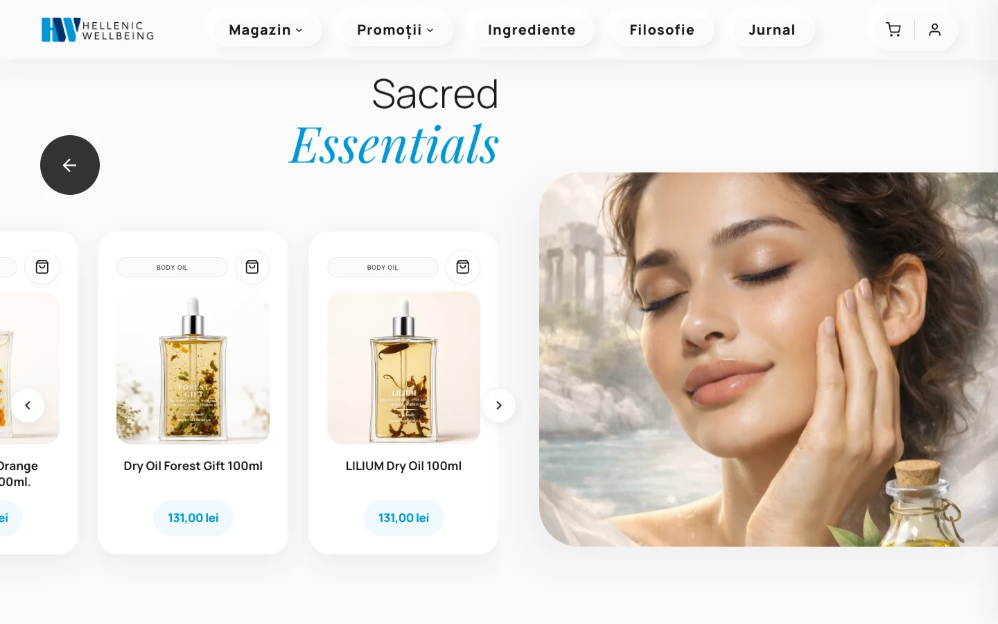
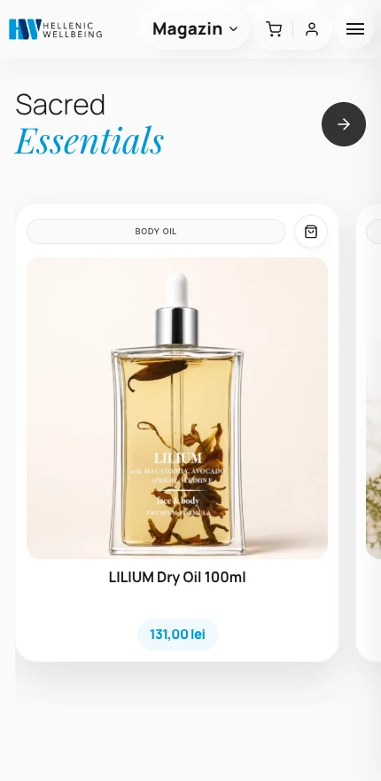
The same journey on desktop and mobile